
Learning how to produce informative and detailed graphical representations of the equipment used for experiments is a critical skill that takes practice and requires detailed knowledge of what is truly important about each component of the apparatus.
For the Single Atom Microscope (SAM) project, we designed and assembled a prototype gas handling system (GHS) which is used to purify, monitor, and control the Neon gas used to grow the solid transparent cryogenic thin films that trap our guest atoms. The purity of the film is critical since it determines the optical transparency of the film as well as the amount of competing optical backgrounds from impurity atoms and molecules. Below is a photograph of the setup:

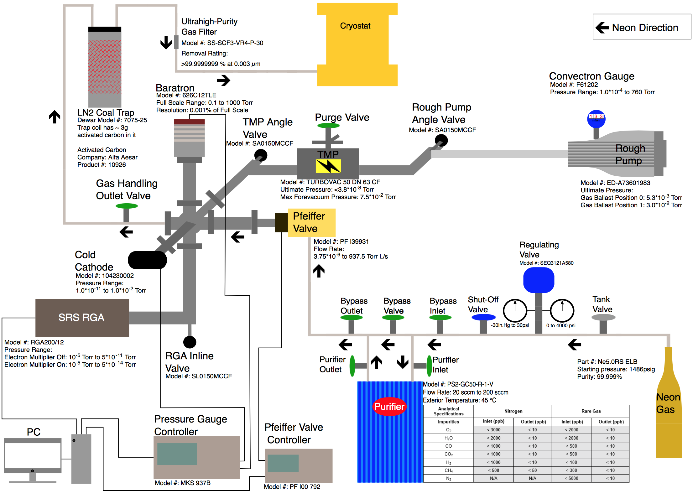
From just this picture, it is difficult to understand how this apparatus operated, what the components are, and the functional relationship between the components. What is needed is an abstracted schematic or cartoon model of the setup. Below is a first draft of a diagram made by Fry depicting this apparatus:

All of the main components are present and the flow of the Ne gas through the system is readily apparent. However, there is essentially no information given which allows the audience to critically evaluate the relevant scale. The most common mistake that my students make is thinking that the relevant scale is simply the dimensions of the equipment and their locations. As a consequence, they often just take a picture of the equipment with their cell phone and paste it into their logbook. A photograph of equipment with no annotations rarely contains any useful information.
In this particular case, the relevant scale is the degree of purity that can be achieved in the Ne gas just after it leaves that GHS and enters the LHe cryostat. Note the improvements in the diagram:
- The components are drawn with just enough detail that the audience can determine what the components are as well as identity them in real life.
- The model number and relevant parameters for each component is listed nearby without the use of a dreaded “lookup table” which was in the first draft.
- The functional relationship between each component and the order of operations can be easily determined by following the arrows.

A publication quality version of this diagram would require careful consideration of the choice of typeface and the size of the text as well making choices about what information needs to be moved into the caption. One of my colleagues, Brian Patton (black shirt/sunglasses), is exceptionally good at this and one example can be found in Figure 1 of this paper:
All-Optical Vector Atomic Magnetometer, B. Patton, E. Zhivun, D. C. Hovde, and D. Budker, Phys. Rev. Lett. 113, 013001 – Published 1 July 2014
Additional information and guidance can be found in the books of Edward Tufte. One example that I particularly like is his effective technique to label many components of a complex object, see here for a discussion of The Ear Diagram. The goal is not to hide the complexity but to explain it in an informative way. -JTS
You must be logged in to post a comment.